
21 October 2026
How to Test a Craft Colour Palette Before You Begin
By OpenClip
Test colour with small samples of the actual materials, compare value and texture, then adjust one shade at a time before committing to the full project.
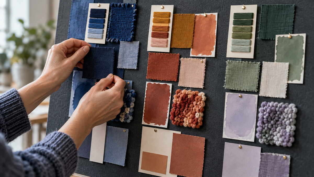
Test a craft colour palette on small material samples before committing to the full project. A useful test includes the actual thread, fabric, yarn, paper or beads you plan to use—not just colours on a screen. Compare the group in daylight and evening light, check the balance from a distance, then change only one colour at a time.
Why a small material test is worth doing
Colours behave differently when they move from a screen or paint chart into real materials. A smooth paper blue may feel crisp, while the same blue in fluffy yarn looks softer and darker. A printed fabric introduces pattern and contrast that a solid digital swatch cannot show.
A small test helps you see those differences before the project becomes difficult to undo. It is not about finding one objectively perfect palette. It is a way to decide whether the colours support the mood, focal point and display setting you have in mind.
Begin with a simple colour job
Before choosing shades, decide what each colour needs to do. Most palettes become clearer when the colours have different roles:
- Main colour: the shade that carries most of the project.
- Supporting colour: a quieter partner that adds depth without competing.
- Accent colour: a smaller, more distinctive note used to guide the eye.
- Resting colour: a neutral or low-contrast area that gives stronger colours room.
You do not need all four roles in every project. A restrained two-colour scheme can be just as considered as a broad palette.
Make samples from the real materials
Cut, wrap or arrange pieces large enough to show texture. Wind embroidery thread around a small card, make a few punch-needle loops, place two fabric pieces edge to edge or build a short row of beads. For paper craft, compare painted or printed offcuts rather than relying on packaging.
Keep the test proportionate to the project. If one colour will cover half the finished piece, give it roughly half the area in your sample. Equal-sized swatches can make a tiny accent seem more important than it will be.
Check value before fine-tuning hue
Value means how light or dark a colour appears. Two different hues can have almost the same value, causing shapes or details to merge. Stand several steps back from your samples or photograph them and view the image in greyscale. If the focal sections disappear, replace one colour with a lighter or darker option.
This is particularly useful for patterned fabric, mottled yarn and sparkling materials, where surface detail can distract from the underlying light–dark structure.
Look at the palette in more than one light
Set the samples near the place where you expect to make or display the project. Check them in indirect daylight, then again under the evening lamps you normally use. Warm artificial light can soften blue and green; cool light can flatten cream, blush and ochre.
You are not trying to make the palette identical in every setting. Look for combinations that remain legible and pleasing even as the light changes.
Test texture and pattern together
Colour is only part of the composition. Place smooth beside textured, small print beside solid and matte beside reflective. If every material is equally busy, the eye may not know where to settle.
Try one of these adjustments:
- Replace one print with a solid taken from that print.
- Move the strongest texture to the focal area.
- Repeat one quiet material in two parts of the project.
- Reduce a bright accent to a smaller proportion.
Change one variable at a time
When something feels wrong, replacing the whole palette makes it difficult to learn what caused the problem. Keep the main and supporting colours in place, then exchange only the accent. If that does not help, restore it and test a different neutral.
Photograph each version in the same light. A simple sequence of images makes subtle differences easier to compare and gives you a record if you need to buy or prepare more material later.
Use the distance test
Close viewing shows texture; distance shows composition. Pin the samples to a board or place them on the floor, then view them from across the room. Notice which colour arrives first, whether the focal area is obvious and whether any section feels detached.
For a project intended for a shelf or wall, this view is often more useful than judging every choice from a few centimetres away.
Know when the palette is ready
A workable palette does not need to feel dramatic. It is ready when the materials stay distinct, the accent leads the eye without overwhelming the whole, and the group still feels coherent in the light where it will live.
If you want a broader starting point, read our guide to choosing a craft colour palette. When you are ready to match colour decisions to a project, browse the current OpenClip craft collection and check each listing for its verified materials and contents.
Questions about testing craft colours
How many colours should I test?
Start with three to five, including any neutral. Fewer colours make proportion and contrast easier to judge; you can add another only when it has a clear role.
Can I test colours on my phone?
A screen is useful for rough planning, but it cannot reliably show material texture, reflectivity or colour under your room lighting. Finish the test with real samples.
What if two colours look too similar?
Compare their light–dark value. Replace one with a lighter or darker version, or separate them with a contrasting material.
Should the accent always be the brightest colour?
No. An accent can stand out through darkness, lightness, texture or temperature. It simply needs enough difference to guide attention.