
25 September 2026
How to Choose a Craft Colour Palette Without Overthinking It
By OpenClip
Choose a craft colour palette with less second-guessing. Start with one favourite shade, give three to five colours clear roles, test the real materials together and know when to stop adding more.
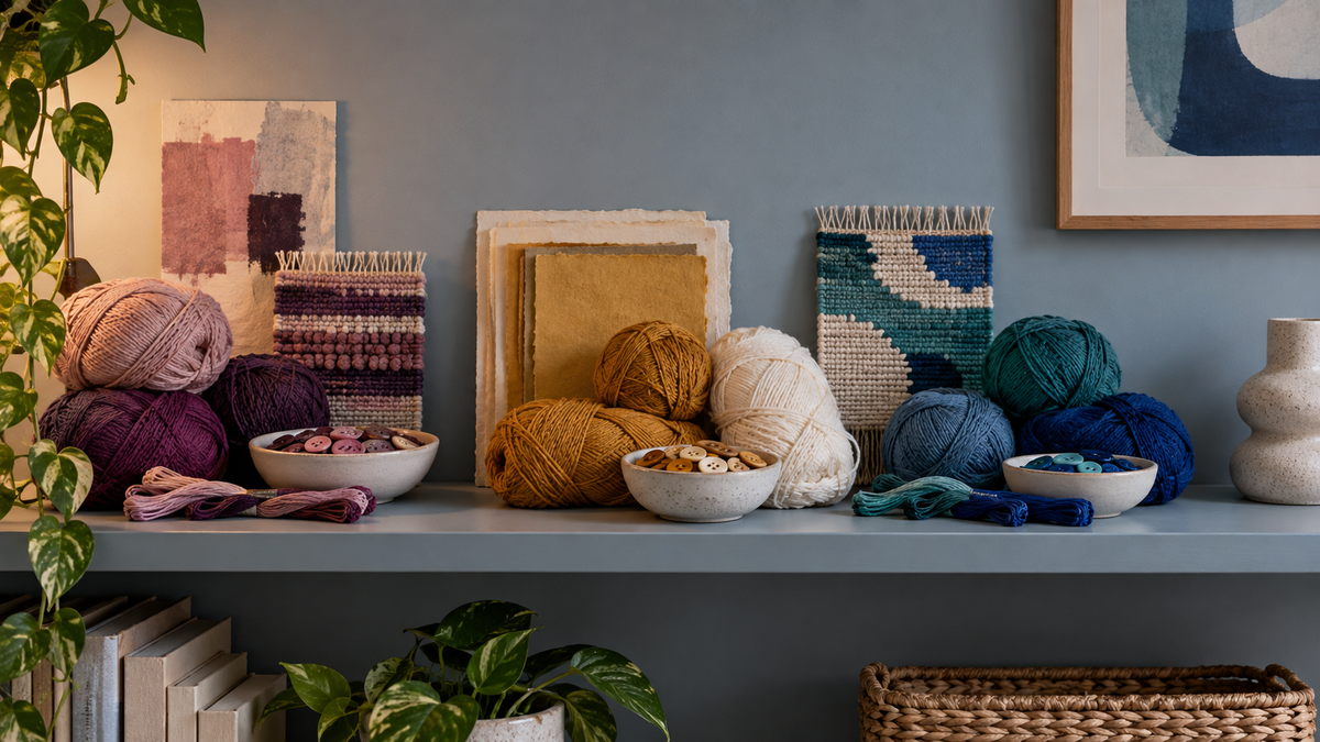
A good craft colour palette does not need dozens of shades. Start with three to five colours: one main colour, one supporting colour, one contrast, and one or two quiet neutrals. Choose them from something you already love, test the group together, then stop adding colours once every shade has a clear job.
Why a smaller palette is easier to use
Colour choice can be one of the loveliest parts of making, and also the point where a simple project suddenly feels complicated. A drawer full of thread, yarn, paper or beads presents hundreds of possible combinations before you have made the first mark.
A limited palette gives the project a direction. It lets repeated colours create rhythm, makes the finished piece easier to read and reduces the number of decisions waiting at every step. Limited does not mean dull. Three well-chosen colours can feel energetic, nostalgic, playful or quiet depending on their balance.
Begin with one colour you genuinely like
Do not begin with a rule about what should look tasteful. Begin with the shade that makes you want to continue. It might be a deep berry yarn, a bright blue bead, a moss green paper or the warm orange in a favourite scarf.
This is your anchor colour. It does not always need to cover the largest area, but it should set the mood. Put it on the table by itself before searching for companions. Starting with one definite choice is easier than trying to judge six colours at once.
Give every colour a job
A practical palette can be built around four simple roles. You can combine or skip roles depending on the project.
- Main colour: the shade that establishes the overall feeling.
- Supporting colour: a neighbour that helps the main colour feel intentional.
- Contrast colour: a smaller accent that adds energy or directs the eye.
- Neutral: cream, charcoal, soft brown or another quieter shade that gives brighter colours room.
Try assigning rough proportions before you begin. You might use the main colour for half the design, the support colour for a third and keep the contrast for a few decisive moments. These numbers are only a prompt, not a formula. Their purpose is to prevent every colour from competing equally.
Three reliable ways to find a combination
Borrow from an object you already love
Look at a print, ceramic piece, book cover, garden or item of clothing that already feels right to you. Select three shades from it rather than copying every colour. This gives you a starting relationship without requiring a formal colour wheel.
Use neighbours with one surprise
Choose two colours that sit comfortably together, such as blush and berry or teal and blue, then add one contrasting accent. The contrast can be small: mustard beside blue, coral beside green or lavender beside yellow. A little is often enough.
Choose one colour in several depths
A near-monochrome palette can feel rich when it includes pale, mid and deep versions of the same hue. Add cream or charcoal if the values need more separation. This approach is especially useful when you want texture and shape to be the focus.
Check light and dark, not only hue
Two colours can be different in name but look almost identical from a distance because they have a similar lightness. Place the materials side by side, step back and squint slightly. If the edges disappear, the combination may need a lighter or darker shade.
A quick phone photo viewed in greyscale can also reveal whether the palette has enough value contrast. This is not a test you must pass. Soft, close values can be beautiful. The check simply helps you understand whether shapes will stand apart or blend gently.
Test the real materials together
Screen colours are useful for collecting ideas, but craft materials respond to light in different ways. Glossy beads can look brighter than matte paper. Fluffy yarn softens an edge. Thread may appear darker when stitched densely. Lay the actual materials together in the light where you usually make.
Create a tiny sample if the project allows it: a few stitches, a short row, a small bead square or several paper pieces placed side by side. A sample answers more than a long debate because it shows colour, texture and proportion at the same time.
Know when the palette is finished
The most useful question is not “Could I add another colour?” You nearly always can. Ask, “What job would the new colour do?” If it does not improve contrast, connect two existing shades or create a deliberate focal point, leave it out for now.
Keep one reserve colour nearby instead of placing it into the project immediately. If the work still feels flat after the first section, introduce the reserve as a small accent. If the project already feels balanced, you have saved yourself another decision.
What to do when the kit already has a palette
A kit or pattern often arrives with its own colour story. You do not need to redesign it to make the project feel personal. Notice which colour leads, where contrast appears and how the quieter shades hold the composition together. Those observations can inform your next project.
If you would rather begin with colours already gathered into projects, browse the current OpenClip Crafting collection. For a more open grid-based activity, our guide to fuse bead making explains how to plan and adjust a pixel-style design before it is fused.
A five-minute palette exercise
- Choose one anchor colour without comparing alternatives.
- Add one colour that feels comfortable beside it.
- Add one lighter or darker shade so shapes can separate.
- Try one contrast colour, using much less of it.
- Remove one colour and compare both versions.
Photograph the two options. Leave them for a few minutes, then choose the version your eye returns to first. There is no objectively correct answer; the exercise is a way to turn a vague feeling into a small, visible choice.
Keep a colour record for next time
When a palette works, save a short record. Tie together leftover threads, place spare beads in a tiny envelope or photograph the materials in daylight. Add a note about which colour you used most and which one acted as the accent.
Over time, these records become a personal colour library. You may notice that you often pair cool colours with one warm spark, or that you prefer deep neutrals to pure black. Repeating a favourite relationship is not unoriginal. It is part of developing your own visual taste.
A small palette is permission to begin, not a restriction. Choose one colour you love, give the others clear roles and let the real materials guide the final decision. Then put the swatches aside and enjoy watching the colours become something made by you.